Helping diabetes patients understand their insulin therapy
I redesigned an automated insulin program for Type-II diabetes patients – so the patients can safely use the correct insulin dose.
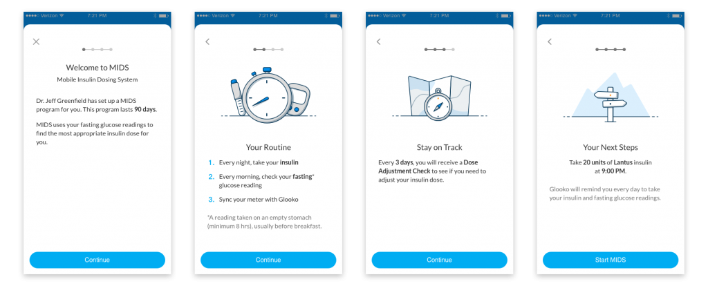
Mobile Insulin Dosing System (MIDS) is a 3-month treatment plan, which checks on a patient every few days to see if they need an adjustment on their insulin dose.
MIDS wasn’t ready to be commercialized
When I started on this product, it was commercially preparing for a public launch. Before that could happen, we needed FDA clearance from our pilot studies. The designs failed – showing patients were having problems understanding what the therapy does and how it works.
We needed to quickly improve the current product to help patients self-manage throughout their treatment plan.
Patients didn’t understand the treatment program
We sought to improve the experience of MIDS onboarding and when patients receive a check-in:
- Reduce interaction complexity occurring within the experience
- Educate patients on key goals
- Motivate patients to continue the program
- Provide the right information at the right time
The team
I worked alongside a Researcher, Product Manager, clinical team, and regulatory team.
My key contributions to the project were to collaborate with the team in heuristic evaluation, information architecture, user task flows, interaction, visuals, and prototyping.
The MIDS program
Type-II diabetes patients
Our users are Type-II diabetes patients who primarily use the Glooko mobile app. These patients are likely on medication, but now have to start using insulin to help manage their condition.
A program to keep patient’s insulin on track
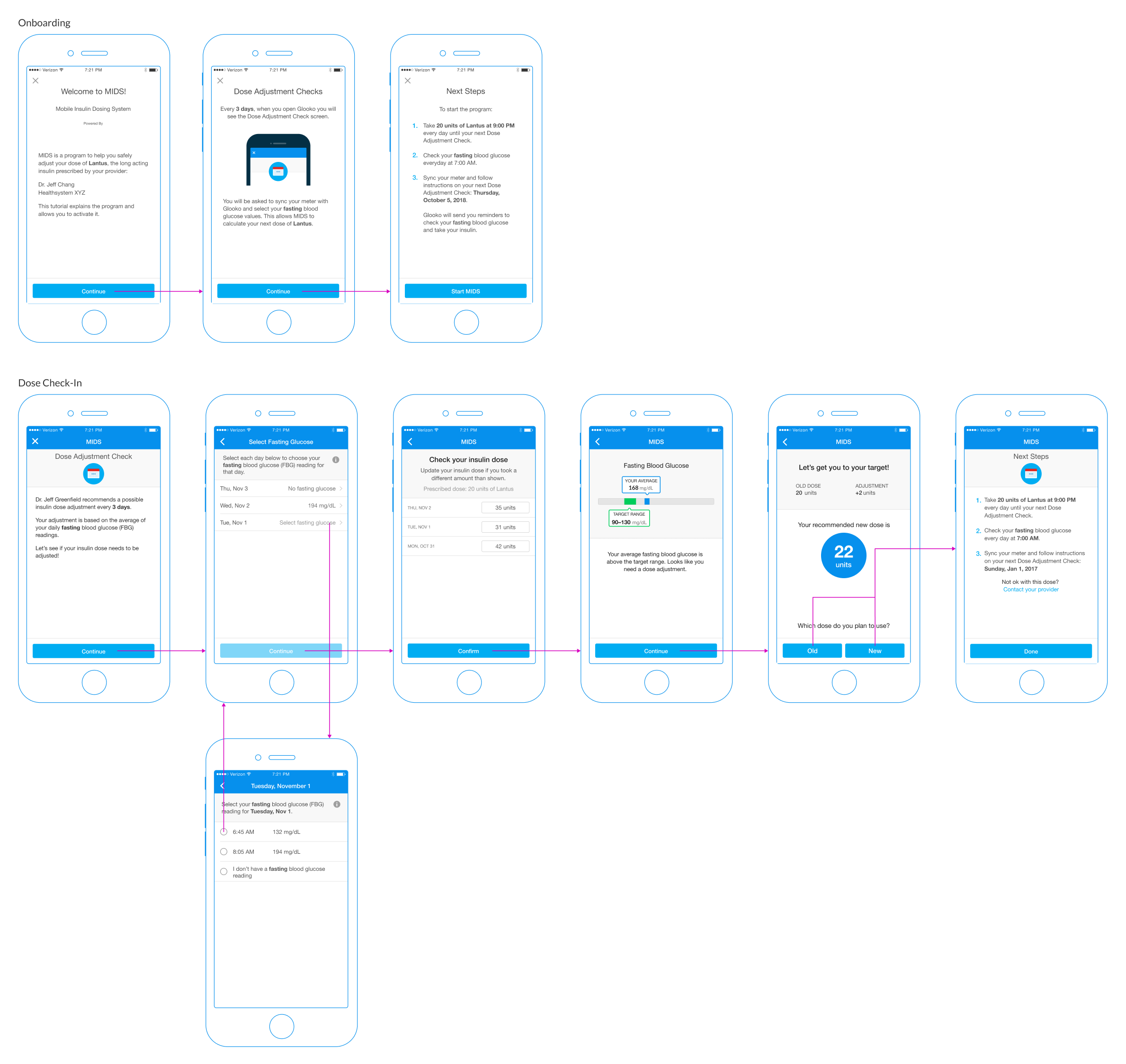
When a patient is prescribed MIDS for the first time, they would encounter informational content to help them understand the details of the program.
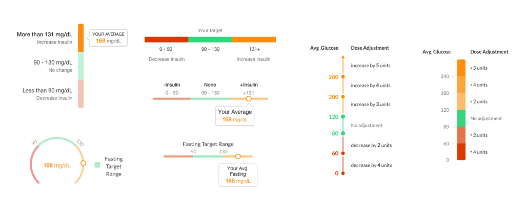
Patients must take a glucose reading every morning and insulin every night. MIDS checks in with a patient every few days – prescribed by their doctor. Patients must increase or decrease their insulin if the average glucose readings don’t fall within the prescribed target range,
Some issues I discovered included:
- Instructions that over-explained the steps to a patient
- Complex language and medical jargon
- Illustrations weren’t providing helpful context
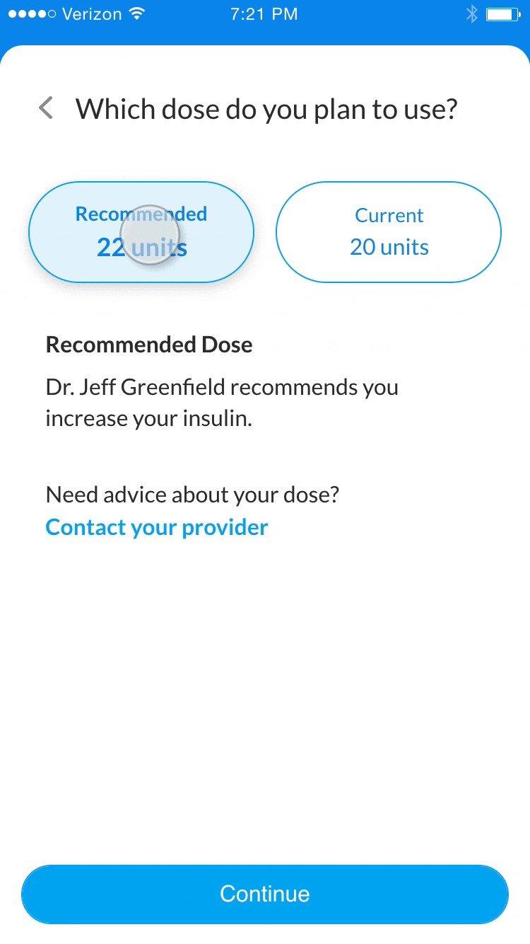
- Choosing doses is a critical step
- Providing help information at the wrong time
Make MIDS easier to use
Designing around regulations
We were unable to change workflow-related screens because changing them would require a new FDA submission. I ended up pushing to provide the right information at the right time and reduce the potential for errors.
Convincing expert stakeholders
The largest challenge was to get all the stakeholders on the same page because many of these stakeholders were professionals in the diabetes industry.
Below is an example of the many iterations it took to simplify the therapy content for patients. I wanted to make sure stakeholders realized patients aren’t diabetes professionals during many of our ideation sessions. This helped us move much faster throughout the design process
Content matters, even down to illustrations
I felt there was a large disconnect between the content and the illustrations from the previous designs – so I created new illustrations to supplement the information for patients to digest.
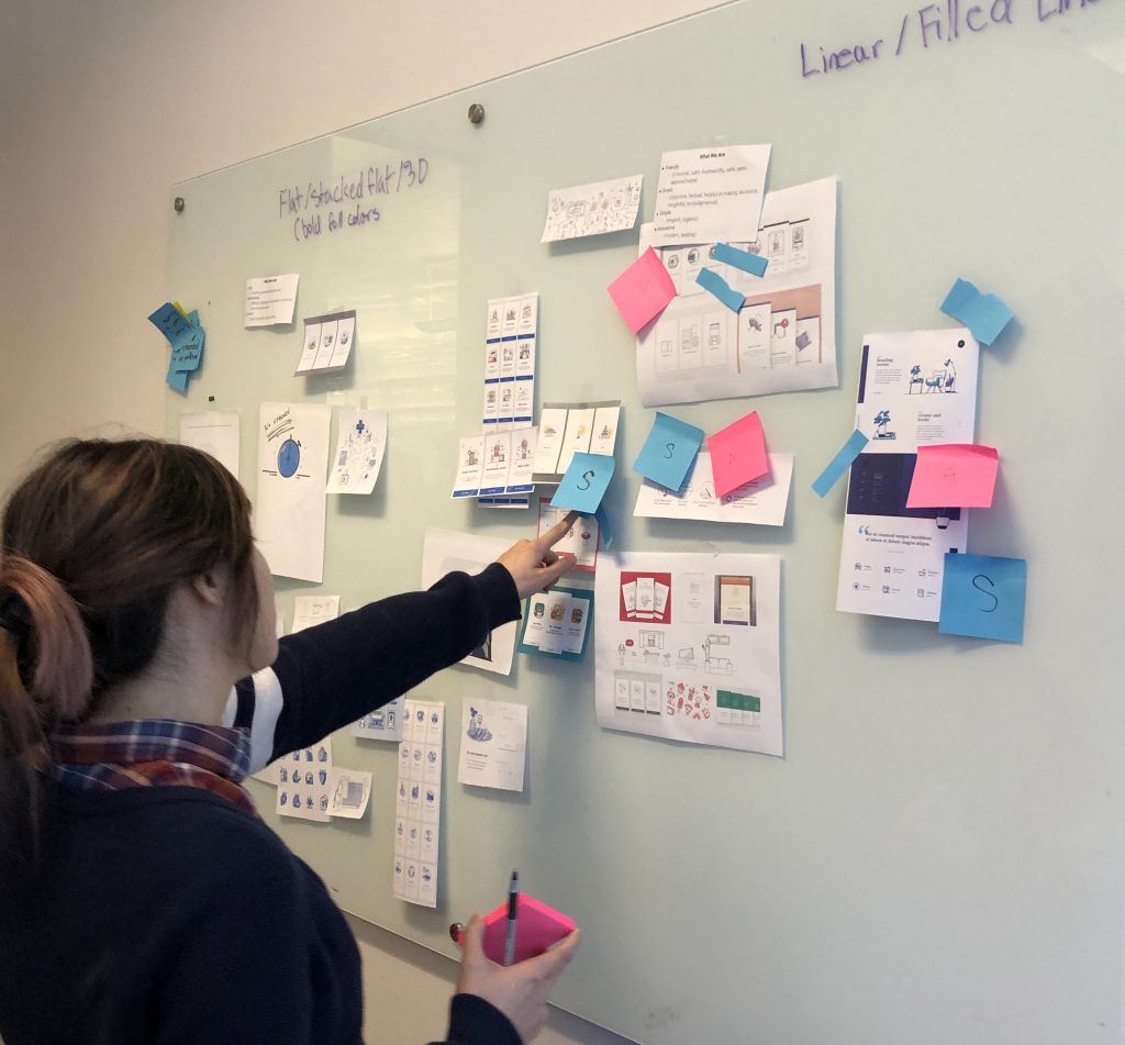
But first, I lead a mood board exercise to help the team set illustration styles, best practices, and standards moving forward. We made considerations based on our brand and the capabilities of our designers.
Onboarding & instructions
The previous design failed to provide easy-to-understand content to inexperienced patients. I crafted an experience for patients to better understand the instructions by:
- Simplifying the language to be more customer-centric
- Removing medical jargon
- Grouping content at the right time
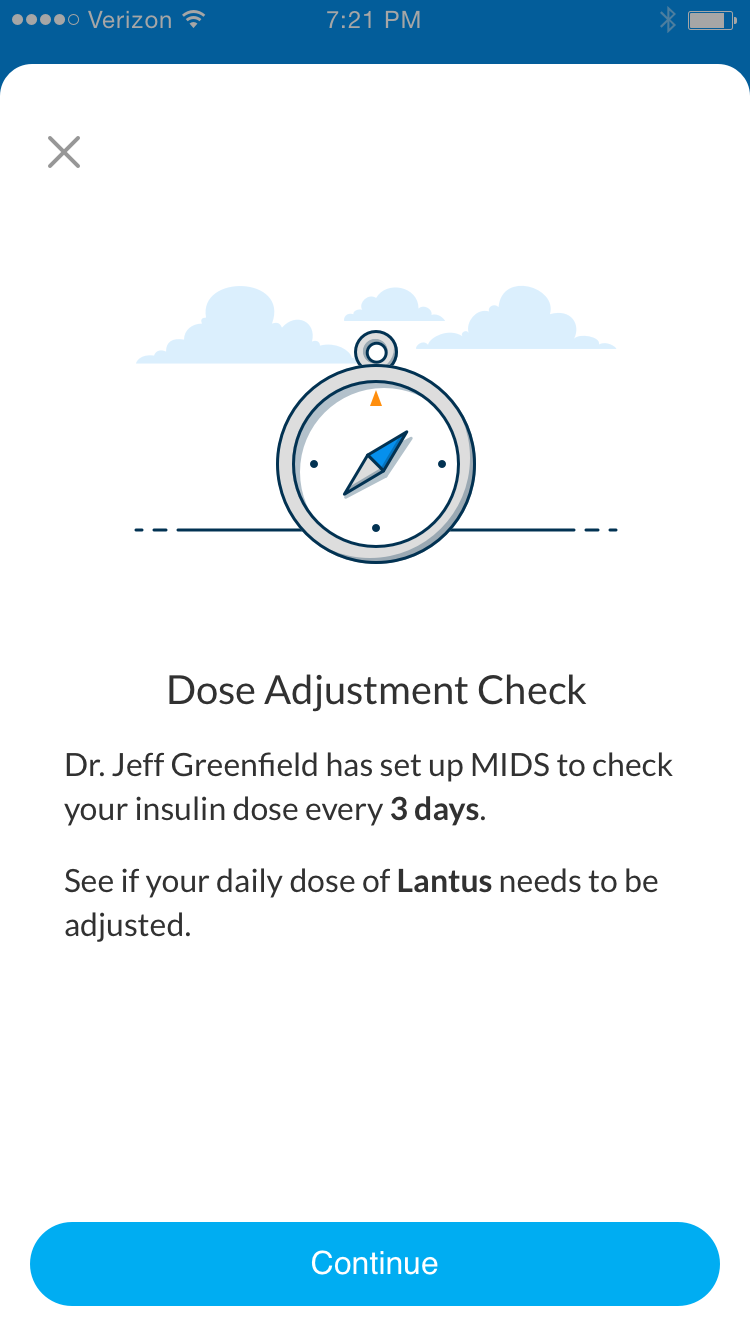
Patient check-in
I reduced the content to be more concise and used the illustration from onboarding to provide a better signal for a dose adjustment check.
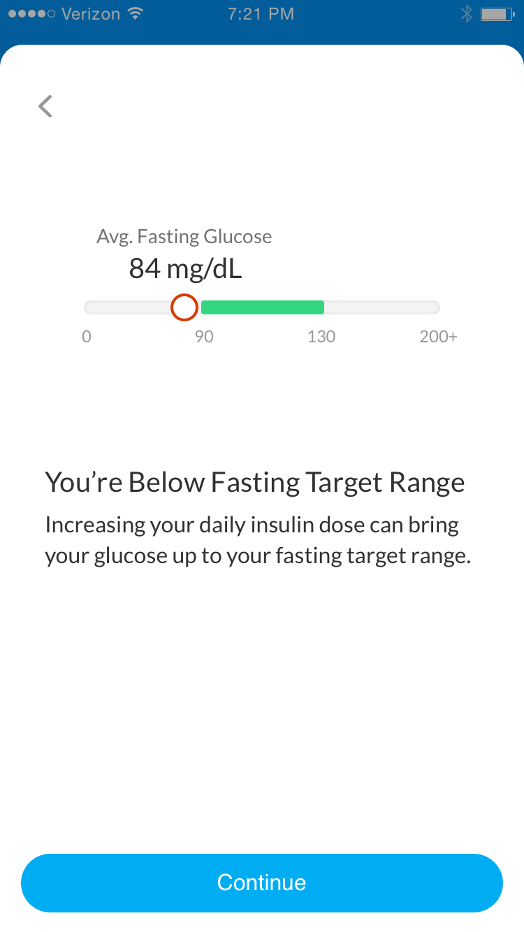
Calculating their glucose
A patient can either receive a success message or a dose adjustment – based on their average fasting glucose.
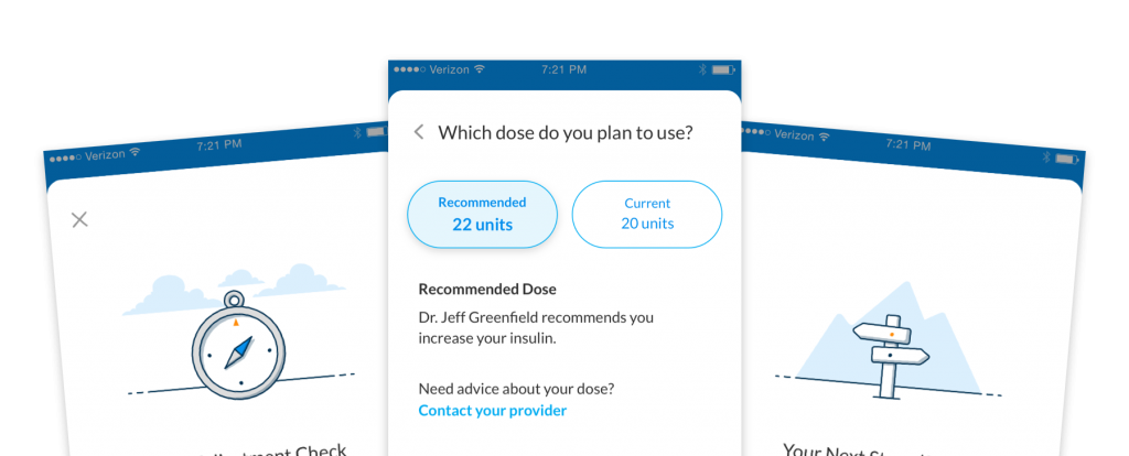
Select an insulin dose
I advocated for a simpler design when patients choose their insulin – which removed any patient error from the previous designs.
It was critical for a patient to understand the context for choosing a dose.
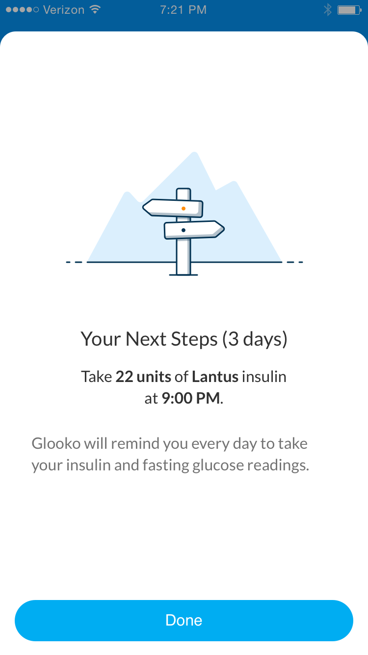
Stay on track with next step instructions
Instructions must be simple to follow. I reduced the content down to the most important information for a patient’s tasks.
Research showed improved comprehension
We needed to perform the same steps in research as when we originally submitted it to the FDA. I worked with the researcher to set up a comprehension test between the previous and new designs.
Out of 14 participants, we found an increase in comprehension (instructions and importance) for the proposed over the current version.
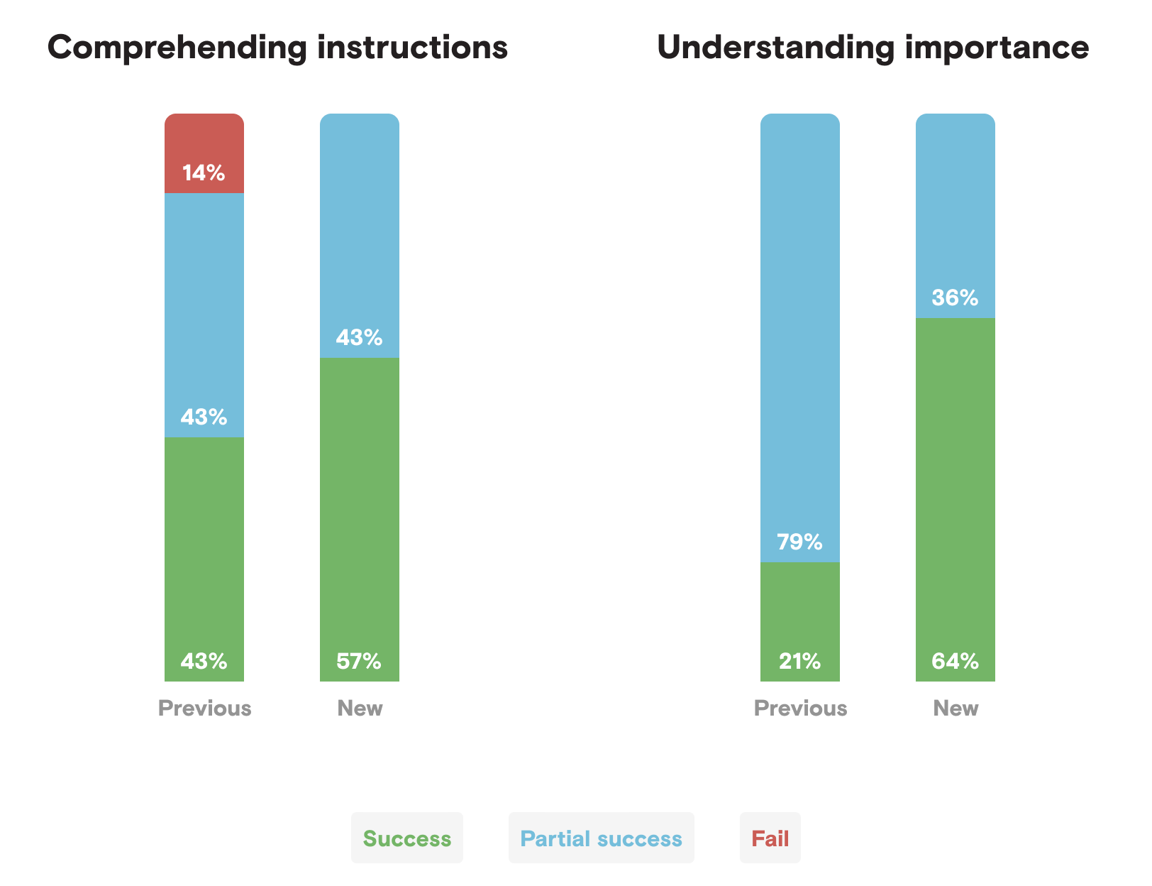
The clinical and regulatory teams felt confident to ship the new designs. The product was soon launched with successful clearance from the FDA.
Future considerations
- Group fasting blood glucose readings by times when they aren’t tagged.
- Combine the days of taking insulin and glucose readings to show cause and effect.
- Continue to add more success states to initiate positive response and motivation.
- Optimize workflow to reduce cognitive load for memorization.